Wednesday, October 23, 2013

Turner UX day take aways

Instead of curating and sending out all my notes, I thought I’d just boil them down to a list of a few take-aways I got from the day.  Feel free to do what you want this these.

8 seconds
Ron Nydam from Apple mentioned that it takes 8 seconds for people to develop an impression of your app.  Ron believes on focusing on the basal ganglia response, the emotional part of the brain, instead of the analytic, mechanical part of the brain.  He wants people to connect naturally, without having to use your analytic brain. Later, Mark Gathen from Cox mentioned his “3X” rule – “customers try to figure things out 3 times...after that they give up for good.”  Ron added, "it's a really short trip to the back of the 'app sock drawer' "

Failure is the rule
Doug Kim worked on the picker for TV everywhere – that’s the screen that lets you pick your cable company then prove you have cable, so that you can watch TV programming online.  He had a stunning graph that showed more people fail then succeed in authentication, and in many cases it’s 2 people failing for each success – a reminder of how complicated and important the problem is.

It’s listening
Those apps that sync up live to TV shows (Like Falling Skies or the coco app) use something called ACR or Automatic Content Recognition.  It works with a high pitched audio signal that's above the range of human hearing.  The device listens to that tone, and constantly coordinates the timing of the show with the presentation on the screen.  Using it the falling skies app would overlay blood splatter or bullet holes in the millisecond someone was cut apart or shot at to more immerse viewers into the show.

Experiences in FOUR dimensions
The MML team went beyond creating personas; they wrote out a whole timeline of stages of interaction for each of those personas.  It outlined how they interact with College Basketball in general (and March Madness in particular) throughout the year…from the start of basketball season all the way through championship game…then used that map to better tailor the app to meet the needs and experience of those users at those times.

Story telling = STORY YELLING
The Sapient guys said people learn more from an experience than from a story, because consumers want to be the hero of their own story.  Typical story telling is a decidedly one-way experience, and many “enhancements” of that model make it just a LOUDER one, not anything different.  With that in mind, their cognitive model is based on city planning instead of architecture.    They created a cool thing for Vail ski resort called EpicMix that gives each skier an RFID tag, then uses that to track how much they ski, compare their times to Olympians, and connect them to pics taken by roving photographers. 

Comps are like fire
The Sapient guys said visual design comps are like fire: sometimes good and sometimes bad.  Having appropriate imaging during testing can help focus users on the tasks at hand (instead of "what does lorem ipsum mean?"), but sometimes the visual comps can make user focus more on the color palette and visual decisions instead of the content that needs to be tested.

Some other quick hits:
  • ·         Sapient occasionally conducts guerilla user research with “social listening” (checking what people are saying about the company on twitter, facebook, etc) in the place of dedicated field studies where the budget requires
  • ·         Ron Nydam mentioned that Facebook has become the unofficial 3rd OS in the marketplace – interesting cognitive model
  • ·         Andreas Adamec said we study gorillas in the wild because we in their natural environment you learn most.  Ask questions, get them emotionally engaged in the app, then just shut up and let them narrate.
  • ·         Ron mentioned in second screen apps, you need to be careful when and how to engage.  People don’t want to be asked ’how do you feel about” something.  He said to listen to the 2,3 and 4 star reviews online, because they hold people whose opinions aren’t clouded with an overwhelming love of hate for the product.
  •  


Tuesday, June 18, 2013

Yahoo! Design Patterns and the E-Mail Sign-Up Form

My mentor, Diane Deseta at UXMentors assigned me an exercise to examine how Yahoo! implements their  design pattern library throughout their site.  This is one of several posts drawn from that assignment.

The exercise brought to light how complicated it is to follow conventions when there are competing motivations behind a page.  In several instances, the patterns were ignored.  Whether these divergences were created by or inherited by the recently fired SVP for User Experience Design Tim Parsey is impossible to know.  The end result left my brow furrowed.

---------

The first part of the exercise was to look at a form on Yahoo.com and to determine which aspects of the design patterns were used.  I chose to study the Yahoo! Email Sign-up page.  I figured this would be a heavily scrutinized form, and thus something that had some interesting properties related to the espoused standards on the Design Pattern page.  I was right.

This form provides opportunities for three different patterns to be used; but, as expected, a couple of them were ignored.

Talk Like a Person - SOMEWHAT APPLIED - This design pattern suggests Yahoo's content should "resist the urge to write like a grad student or a bureaucrat." Although the language used on the form is clear (ex: "The ID you select lets you sign in to all Yahoo! products and will be used for your free Yahoo! email address") it is far from casual and has the feel of a pitch that has been worn down over dozens of iterations; however, this same pattern encourages the use of contractions and when picking a password, the phrase "don't use your name or Yahoo! ID" appears.

I expect the mandate to speak casually was ignored due to the heavy scrutiny the page has received, the likelihood that anyone working on it has stared at this language hundreds of times, and the desire to be both precise and careful with the wording.


Your Vs. My - FOLLOWED - This pattern encourages the use of the personal pronoun "your" over "my" as the use of ‘my’ “implies egocentrism and discourages sharing." On first glance, one would assume that since email is used primarily to share things with others, the use of "my" is incorrect, as it would subtly disincline users from sharing.

The same pattern, however, says that the use of ‘my’ is acceptable "for private, individual environments" and though email is obviously a medium for sharing information, the sign-up form is not.  If anything, the sign up form is to be seen by only the user, and thus the use of ‘my’ makes sense here.


Terms of Service - IGNORED - Both the letter and the spirit of this design pattern are ignored.  The intent is to prevent the user from feeling dumb for not clicking an 'agree' button or ticking a box when accepting the terms of service.  To prevent this, the design pattern encourages a passive opt-in model for the terms of service composed of five elements that work in tandem:

·       Consent to the agreement is expressed in the call-to-action button ('Agree and Continue').
·       The form offers an option to exit without agreeing ('Cancel' or 'Don't Agree / Cancel Order').
·       A statement makes clear that submitting the form constitutes agreement to the terms ('By clicking you agree...').
·       The terms of service (TOS) text is available via a clearly labeled hypertext link (Terms of Service').
·       The TOS copy is supplied in a printable format.

Notably, the pattern explicitly says, "removing any one defeats the purpose of the pattern." But, the sign in form does exactly that.  While the 2nd through 5th elements are followed, the button simply reads "Create my Account." 

So, why ignore this when changing the button to read "Agree and create my account" would be so easy?  The scrutiny that such a heavily used form likely receives probably plays a large part in this: in the race to get and keep subscribers against Gmail and Hotmail (Yahoo! is currently ranked 1st domestically and 3rd internationally in terms of subscribers according to 2012 ComScore data) anything that may lead to a closer read from people wondering what they're agreeing to (and potential failure to complete the form) is likely discouraged.  

To verify whether drawing attention to the ToS may be an issue, I studied the competitors’ sign-up forms.  Hotmail uses an "I agree" button for new account creators, and Gmail has a box for new users to tick so they actively agree to TOS before clicking the "Next Step" button.  Perhaps Yahoo! believes this deviation from its own pattern is a point of difference that makes them a leader.  

If so, it is a dishonest trick, and builds the foundation of the relationship with their users on a calculated deception.


Tuesday, June 4, 2013

The good (and bad) that I learned from Edward Tufte

When I was 13 years old, I was granted a press pass to see a Duke Blue Devils Men's Basketball game.  This was back in 1991, after they'd won a national championship and before they won a second.  I was thrilled that the athletic director had chosen to accept my crudely photocopied letterhead request for a credential.  It's safe to say it was a defining first experience for me as a journalist.

In the locker room after the game, I had a chance to ask Bobby Hurley a question.  Bobby Hurley was Duke's starting point guard, a position I also played (poorly) and Hurley was the player I admired more than anyone.  Nervous and sweating in my bar mitzvah suit, I rattled off my question and he gave me a quizzical look.  He stared away and said "I don't understand what you mean" and walked off.  

I was crestfallen, though I'd learned a valuable lesson: knowing a man for his public persona doesn't mean you actually know him as a person.  More importantly, I learned that when you come to find out the person he really is you may be disappointed.

Edward Tufte had reached that same level of admiration in my eyes.  Not only had this man single-handedly made the use of the infographic a mainstream tool, his writing cobbled together lessons from disciplines and sources that spanned centuries of knowledge and condensed them in a way to make the world a clearer and more logical place.

So when I came across something in his book The Visual Display of Quantitative Information that gave me pause, I was excited about the opportunity to engage him in a clear, intelligent way so I could learn more about the field of User Experience.

Since I first started studying UX, I was overwhelmed by how accessible the brilliant minds of the industry were to the average person.  Ken Schwaber (signatory to the Agile Manifesto), Louis Rosenfeld (the IA genius, and co-author of the 'Polar Bear Book,' required reading in the field), and even Don Norman (author of the seminal work 'The Design of Everyday Things') had personally entertained and replied to my questions, even though I was just beginning to learn about the field.

My issue with Tufte began with a questionable citation.  As a journalist, I believe overt, clear citation is an indication of transparency.  When a source becomes vague about the basis for his or her information, it brings his or her credibility into question.  My specific question to Tufte was the following:


On page 95 [of The Visual Display of Quantitative Information] reference is made to a re-drawn graphic comparing predicted registration rates to actual registration rates.  The text reads "Another published version of the same data drove the share of data-ink to about 0.7, an improvement."  However, this lauded improvement leaves out an important caveat - it is your work.
While, of course, it is the responsibility of the diligent reader to check the sourcing on all information he/she receives, it struck me as a bit disingenuous to leave out how self-congratulatory this text actually is.  It struck a sour chord, especially when including a reference in the text itself that it is the work of the author would have done nothing to diminish the point.
A second instance of a similar type assuaged any concerns that this was being done by an author who could find no flaws with his own work.  In the same book, on page 184, a design titled "The Relationship Between Seats and Votes in Two-Party systems" is described as "heavy-handed, with nearly every element out of balance."  This work is also that of the author, though only the reader of the citation for the graphic would have noticed this.
In "Beautiful Evidence," on page 142, you rail against the evasion of responsibility by presenters and authors.  I feel these examples, while TECHNICALLY giving attribution require more blatant note that the exemplars used are those of the author, in the name of genuine transparency.

I understand that the standards for academia and the standards for journalism are different, and while certainly not an attack of the incredible work Mr. Tufte has accomplished, I thought I had a genuine question that deserved an answer -- or at least some debate, acknowledgement or correction of my ignorance.

Sadly, Mr. Tufte felt none of that was required.  I initially tried to find a way to contact Mr. Tufte directly, but could not find a way to do so (despite having spent several hundred dollars on his books and seminar in Atlanta).  I submitted my question to his closely curated forum, but the moderators did not deem my question worth posting.  I emailed his assistant, and still weeks later have not received a reply.  I even, in a last ditch effort, posted a tweet asking how I could reach out to address the issue, but that too was ignored.

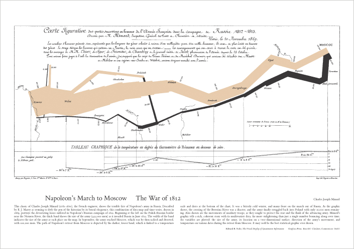
I think no less of the work Mr. Tufte has accomplished.  He is clearly a brilliant, erudite man with an uncommon talent for explaining complicated data sets in visually stunning ways.  A poster of his interpretation and translation of Minard's map of the fate of Napoleon's army as they marched to Russia sits over my desk as I type this.

Despite that admiration, this experience reminds me of being that kid in the Blue Devils' locker room in Durham, North Carolina.

For a high school graduation gift, my brother got me front row seats to see my hero, comedian George Carlin, record his HBO special at the Beacon Theater.  After the show, I waited outside to meet George, and when he came out I blurted out that he was my idol.

"You need to be careful who you make your idols out to be, kid"

George was right.

Saturday, May 25, 2013

Yahoo! Design Patterns and Yahoo! News

My mentor, Diane Deseta at UXMentors assigned me an exercise to examine how Yahoo! implements their  Yahoo's design pattern library throughout their site.  This is one of several posts drawn from that assignment.

The exercise brought to light how complicated it is to follow conventions when there are competing motivations behind a page.  In several instances, the patterns were ignored.  Whether these divergences were created by or inherited by the recently fired SVP for User Experience Design Tim  Parsey is impossible to know, the end result left my brow furrowed.

---------


Navigation Tabs - APPLIED WHERE CONVENIENT - The use of navigation tabs is to provide a clear way for the user to see where they are (in this case - in the Yahoo! News section) and easily determine how to get to other parts of the site. 

The place where this convention is ignored is the number of tabs.  The design pattern explicitly says no more than 10 tabs should be used though 13 appear here.  

Why violate the pattern? I’m guessing there are 13 individuals who have titles that correspond to curating the sections delineated by those tabs.  

The solution to this would seem pretty clear cut - merge a couple of the tabs.  Science/Health/Technology seem good candidates, and "local" and "popular" don't even seem to be the same kind of label, thereby further diluting the power of the convention.  Even the example given in the design pattern shows a different implementation from the one being used on the live site.

Here’s the example given with the design patterns:

Here’s the live page:


I'm guessing the people responsible for curating the site have louder voices than those who compile the design patterns.


Page Grids - FOLLOWED - The layout of the page uses the large column on the left and a thinner column on the right (the first pattern shown among the four preferred layouts):


The pattern encourages the use of these grids because:
·       Templates reduce designers' preparation time and let them focus more on the site's content and features.
·       Consistency across pages and page elements contributes to a cohesive brand and user experience.
·       A common source code offers a number benefits:
o   Reduces the number of subtle or major variations in the page layout.
o   Expedites development and global page updates.

The code for the page shows that a CSS and HTML template was indeed used to lay out the page...these templates are likely populated by the CMS used for news items (which, themselves, are also likely auto-populated by content providers (in this case AP)

Wednesday, May 22, 2013

Yahoo! Design Patterns and Shopping; Search results pages

My mentor, Diane Deseta at UXMentors assigned me an exercise to examine how Yahoo! implements their  Yahoo's design pattern library throughout their site.  This is one of several posts drawn from that assignment.

The exercise brought to light how complicated it is to follow conventions when there are competing motivations behind a page.  In several instances, the patterns were ignored.  Whether these divergences were created by or inherited by the recently fired SVP for User Experience Design Tim  Parsey is impossible to know, the end result left my brow furrowed.

---------

Yahoo! Shopping page examined: http://tinyurl.com/kbahrvc

Rating an Object - UNCLEAR - The mechanism for rating an object follows the conventions of the design pattern, but one "consideration" appears unconsidered (or, if addressed, was decided against ease of use).  

The pattern states "Consideration should be made about the call to action for a rating if a user is not logged in." and while I can't know IF consideration was actually made, the result was that if someone goes to rate the item, and they are not logged in, they are yanked from their current page and forced to log in.

The stated purpose of the star rating device is allow a user to quickly leave their opinion...but forced log-in defeats that purpose.  Perhaps greying out the stars (or a tool-tip saying ratings can only be left when logged in) could help achieve both goals, but that doesn't happen.  

This may have been accidentally overlooked, or perhaps done to use this function to encourage people to log in so buying behavior can be tracked...but it discourages user input in favor of potentially gathering better data.  Since that purchasing data can be valuable, I expect the decision was made to force log-in...but surprising the user with that decision seems lazy.


Top navigation - FOLLOWED - The design pattern seems to state that the top nav could be accompanied with a secondary level of navigation, but since each product would likely bring the user many levels deep, they chose to use breadcrumbs for that purpose.


Breadcrumbs - FOLLOWED - Unlike on the travel page, the use of breadcrumbs on the shopping page precisely follows the design pattern.

---------

Yahoo! Search results page examined:  http://tinyurl.com/latqyav 

Search Pagination - FOLLOWED - While the conventions for Search Pagination are followed, extraneous boxes are drawn around each number in a well-intentioned attempt at a "re-design."  This additional non-data-ink would make Edward Tufte sad.

Module tabs - IGNORED - The design patterns include a way to handle multiple kinds of information on the same page...using module tabs.  The search results, though also displaying different kinds of information (in this case results), instead use a quasi-top-nav format that's neither a top nav nor module tabs.


I expect this was ignored also due to a desire to "re-design" and "freshen up" the results.